Choreless Booking Flow, 2023
Choreless is a laundry pickup and delivery service in Seattle. The first booking flow made signing up and placing a first order one flow: a verified phone number, a map-first address, three services explained up front and a single summary, shaped over four design rounds.
- Client
- Choreless Laundry
- Role
- Product designer (UX / UI)
- Scope
- Web booking flow, handoff
- Status
- Shipped
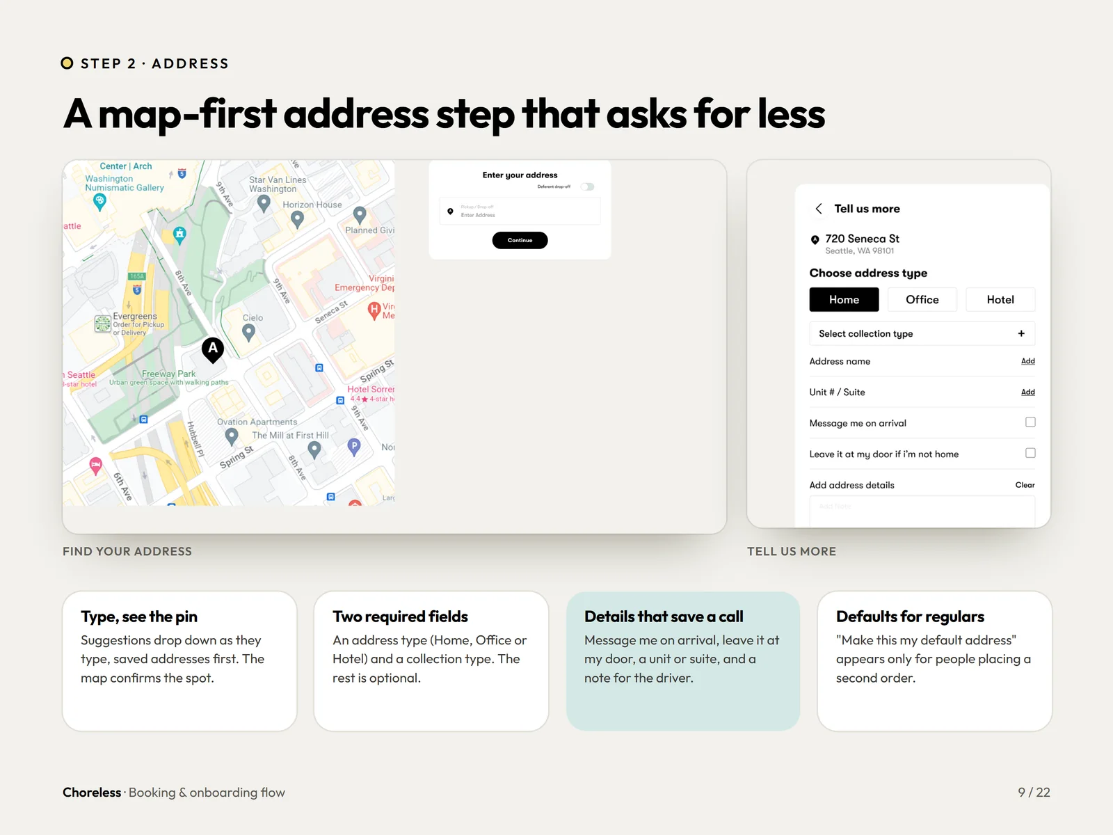
Six things the flow had to get right.
New and returning customers share one flow, the final price depends on weight, and turnaround changes by service.
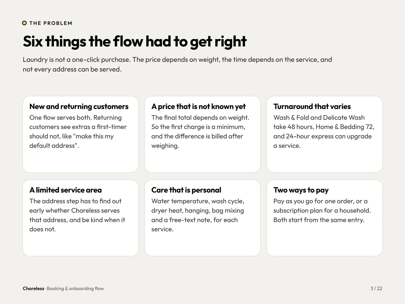
Five steps from hello to booked.
A numbered header and progress bar on every screen. Returning customers skip straight to the dashboard.
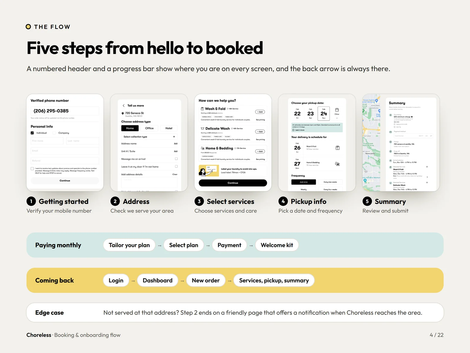
Four rounds before it looked this simple.
Versions 2, 4, 5 and 6 each moved the flow closer to one clear screen per step.
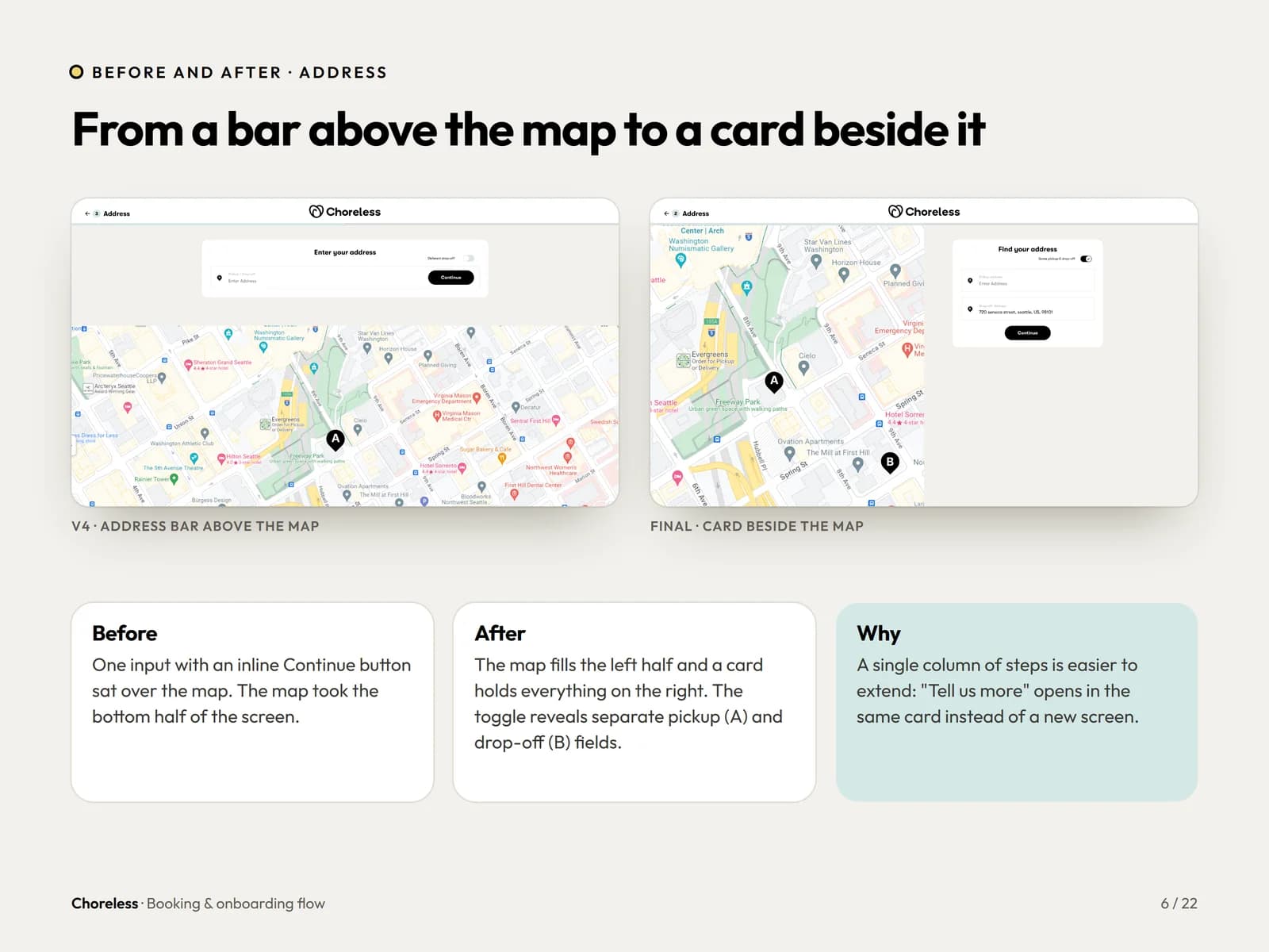
From a bar above the map to a card beside it.
One inline input became a card beside the map, so each screen answers one question at a time.
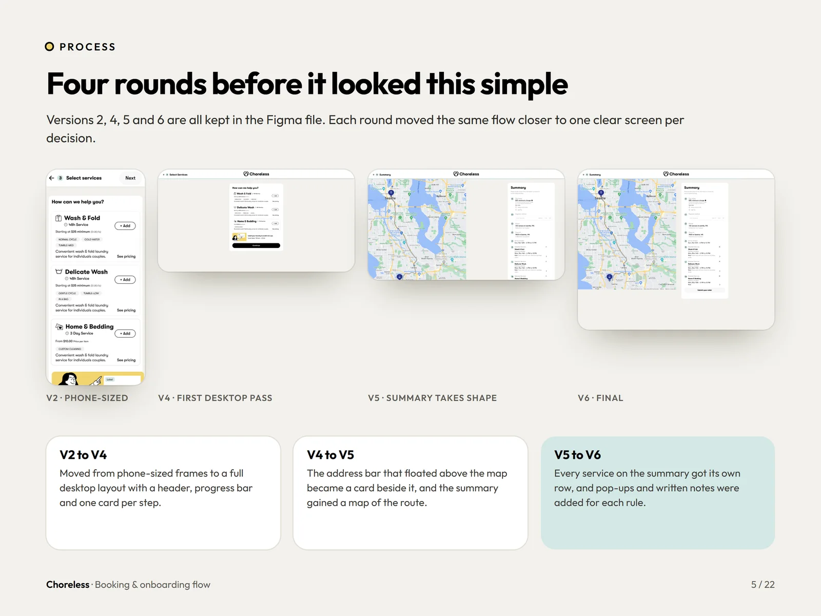
A map-first address step that asks for less.
Type to see pin suggestions, with the map confirming the spot. Only the address type and collection details are required.
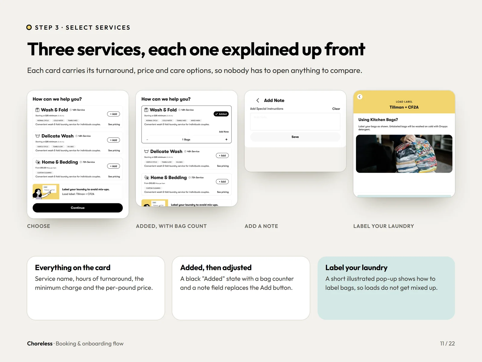
Three services, each explained up front.
Every card carries turnaround, price and care options, so nobody has to open anything to compare.
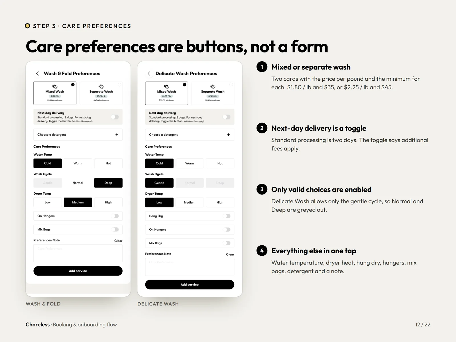
Care preferences are buttons, not a form.
Water temperature, dryer heat, detergent and notes in one tap each, with only valid choices enabled.
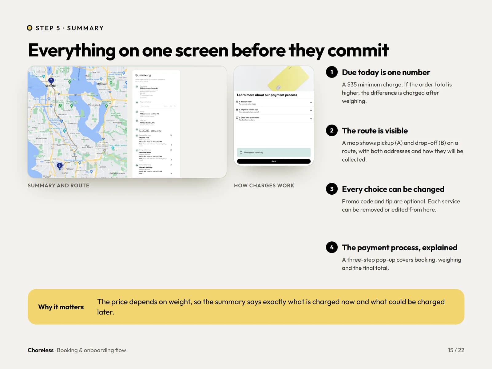
Everything on one screen before they commit.
Due-today amount, route, charges and promo code in one place, and every choice can still be changed.
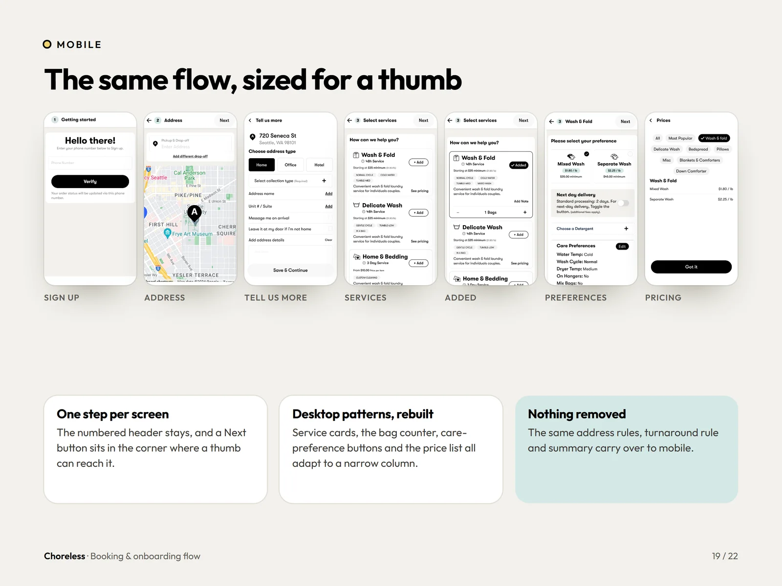
The same flow, sized for a thumb.
One step per screen and the Next button where a thumb reaches. Nothing removed from the desktop rules.
Want a flow this clear?
A booking flow earns its keep on the first order. If yours makes people verify, retype and guess the price, we can show you a shorter path.