Maven Yoga Studio
Maven had a studio worth showing up for and a homepage that buried it — a hero image too busy for its own headline to read against, and the mission, the practice and the teachers all sitting underneath as unbroken paragraphs. We rebuilt it around one rule: every idea gets its own visual anchor rather than a place in a paragraph. Their existing class-booking system is embedded into the page, so nobody leaves the site to book.
- Business
- Maven Yoga Studio
- Location
- Fremont, Seattle
- Scope
- Full redesign, 5 pages
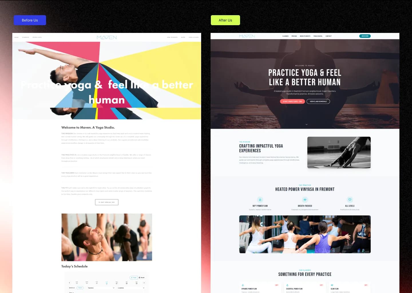
It read like a blog post, not a studio.
A busy multi-colour geometric hero with the headline fighting the artwork for contrast — unreadable at a glance, at the moment a studio can least afford it.
The mission, the practice, the teachers and the class fit each a paragraph of unbroken text under a small heading, one after another down the page.
Nothing anywhere telling a visitor where to look next.
Same studio, same message, finally legible.
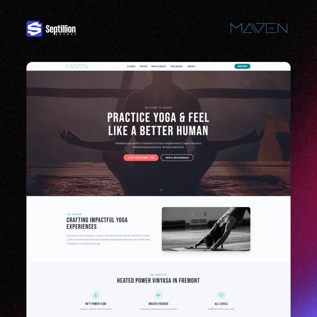
The hero kept the line Maven already had — practice yoga, feel like a better human — and moved it onto a single grounded photograph under a consistent dark overlay, so the type reads against any part of the image instead of against a background that changes colour underneath it.
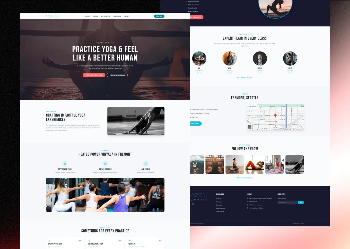
Every idea gets a visual anchor, not a paragraph.
The heated power vinyasa pitch became three icons with a line each — 98°F Power Flow, Breath-Focused, All Levels — instead of a paragraph explaining the same thing. The mission sits beside a real practice photo rather than standing alone. Nothing on the page asks a visitor to read their way to the point.
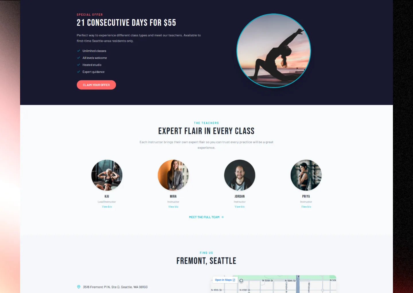
Teachers you can put a face to.
Instructor introductions are circular headshots with a name and a one-line role rather than a bio block, and the studio's own offer and its Fremont address sit in their own sections instead of in a run of text. Someone deciding whether to walk into a heated room for the first time is deciding about people and a place, so both are shown rather than described.
Their system, on their page.
Maven already ran a class-booking platform before we touched the site, and we did not replace it. What changed is where a visitor meets it: instead of a link handing someone to a separate booking domain, the system is embedded into the page itself. Nobody opens a new tab and nobody lands on a generic scheduling layout at the exact moment they were ready to commit — which is usually where a fitness booking leaks, rather than at the price or the schedule.
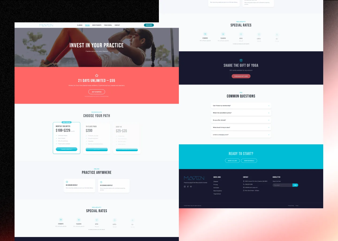
Rates that answer the question before it is asked.
The rebuild became five pages rather than one long scroll — Classes, Pricing, New Students, Yoga School and Contact. Pricing puts memberships, drop-in rates, on-demand options and the studio's inclusivity rates for students, teachers, BIPOC, LGBTQ+ and 55+ practitioners side by side, with a gift-card route for anyone buying yoga for somebody else.
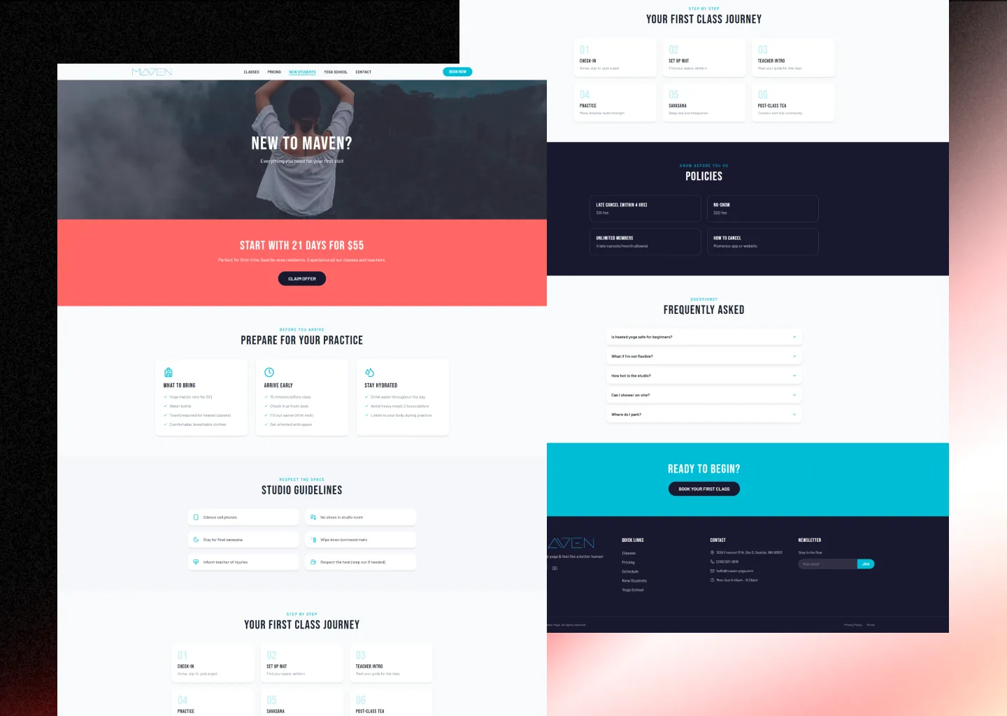
What actually happens, step by step.
New Students walks a first-timer through what to bring, when to arrive and what a first class is really like — check in, set up your mat, meet the teacher, practise, savasana, tea afterwards. Studio guidelines and cancellation policies sit on the same page. These are the questions someone has before they have ever set foot in a heated room, answered before they have to ask one out loud.
A rebuild, with both states on the record.
A hero that reads at a glance, carrying the message the studio already had.
Every section given its own visual anchor — icons, real class photography, instructor headshots.
The existing class-booking platform embedded on-page rather than linked away to a separate domain.
Five pages each doing one job, in place of a single scroll doing none of them well.
Got a site that buries what is actually good?
Book 20 minutes. No pitch deck, just your business and what a site would need to do for it.
Talk to us directly
Book a call with our CEO
No account manager, no hand-off — you talk to the person actually building your site.
Want a flow this clear?
Free preview in 48 hours, live in 5 business days. Nothing to pay until you've seen it.